


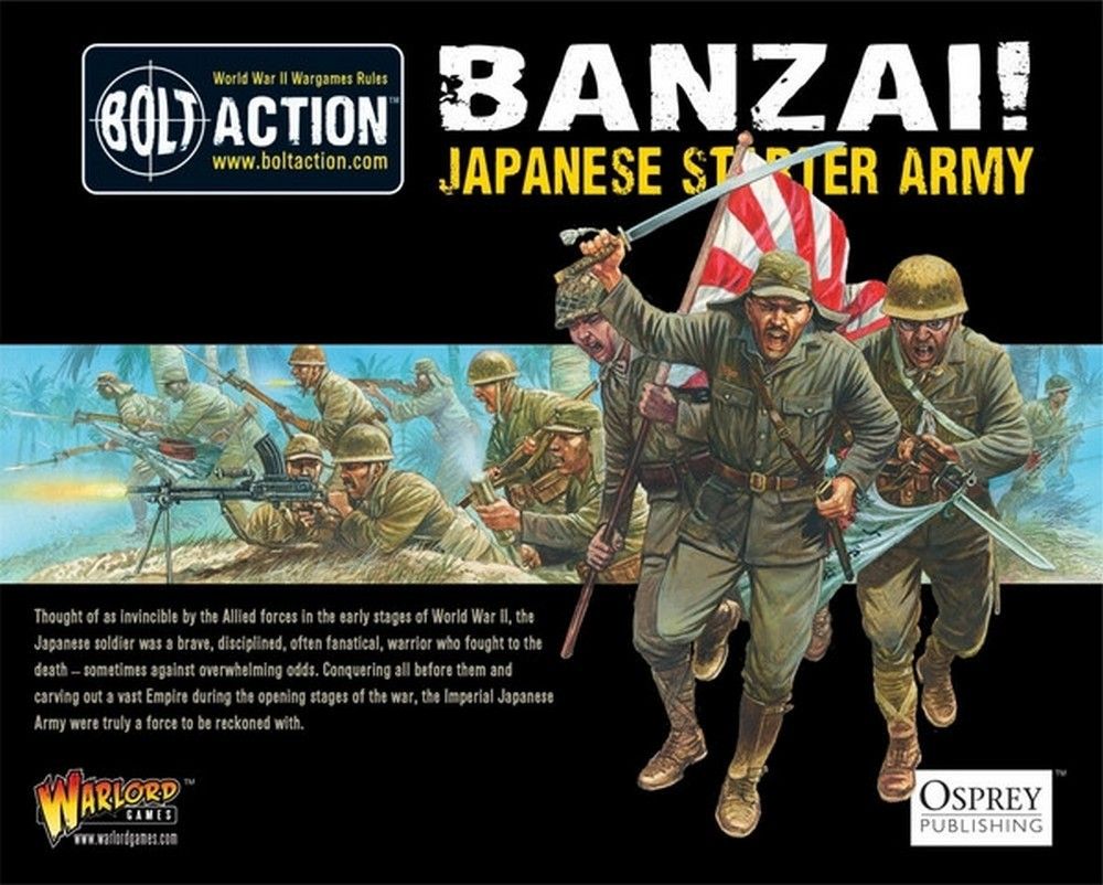
Imperial Japanese Army infantry look wrong the instant the uniform goes too sandy. The IJA tunic is a mustard khaki - a yellow-brown with real chroma in it, not the dusty beige of desert drill - and if you paint it the same colour as an 8th Army figure you have painted a British soldier in a different hat. The second thing that makes them read as Japanese is that the puttees, webbing and pack straps run a shade greener than the tunic. That two-tone khaki is the signature, and it costs one extra pot.
The signature look
Mustard-khaki tunic and breeches, greener khaki puttees wound from ankle to knee, warm reddish-brown leather kit, a Type 90 helmet often netted or tied with foliage, and one small hot red note - a rank patch, a flag, the sun disc on a banner. The overall model is warm, which is unusual in WW2 ranges dominated by cool drabs, and it is why a Japanese squad stands out on a table full of Germans and Soviets.
The mustard-khaki uniform
Undercoat black or dark brown; the mustard is bright enough that a light undercoat leaves you no shadow to work from.
- Basecoat Vallejo Model Color Japanese Uniform WWII, two thin coats. It is the reference tone and covers awkwardly in one pass - be patient with the second coat rather than laying it on thick.
- Shade with Agrax Earthshade in the folds. Seraphim Sepia over the whole garment is a good alternative that keeps the yellow, where a black wash will grey it out entirely.
- Layer Japanese Uniform WWII back over the raised cloth: chest, shoulders, the front of the thighs and the tops of the breeches.
- Highlight with Japanese Uniform WWII mixed two to one with Green Ochre, then a very light final catch of Dark Sand on shoulders, elbows and knees.
For officers and for the sun-faded Pacific island garrisons, add Iraqi Sand to the highlight mix and take it a step further. For a browner, dirtier late-war look, mix a little US Field Drab into the base.
Citadel equivalent: Zandri Dust basecoat, Agrax Earthshade, layer Zandri Dust, highlight Karak Stone and then Ushabti Bone on the sharpest folds. Army Painter Fanatic: Command Khaki shaded Sepia Tone and highlighted Tomb King Tan.
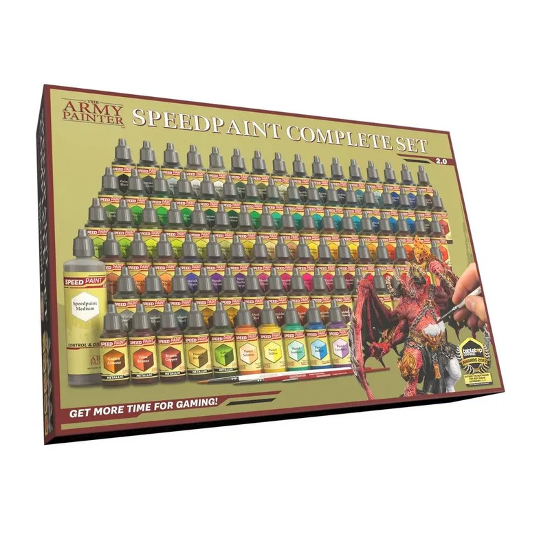
Speed route: undercoat Wraithbone, one coat of Citadel Aggaros Dunes contrast or Army Painter Speedpaint Brownish Decay, then a single edge catch of Dark Sand. Both keep the yellow, which most one-coat khakis do not.
Puttees, webbing and leather
- Puttees and canvas gaiters: Khaki shaded Agrax Earthshade, highlighted Khaki with a touch of Dark Sand. Sitting a step greener and duller than the tunic is the whole point - if the legs match the body, the two-tone effect is gone.
- Pack, haversack and shoulder straps: Green Ochre basecoat shaded Agrax Earthshade, or Khaki for a more worn look.
- Belt, ammunition pouches, bayonet frog and boots: Cavalry Brown basecoat, Agrax Earthshade shade, Orange Brown highlight. IJA leather is warm and reddish, not the cool near-black of German kit, and it is worth exaggerating slightly at 28mm.
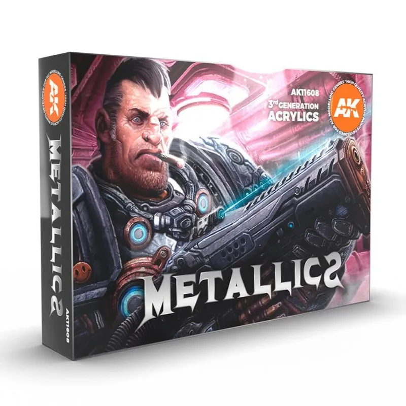
- Arisaka rifle: Flat Brown stock highlighted Beige Brown, Gunmetal metalwork shaded Nuln Oil. Citadel: Leadbelcher into Runefang Steel.
- Faces: Basic Skin Tone, Agrax Earthshade, Medium Fleshtone, a small touch of Light Flesh. Keep the shade heavier than usual - almost every IJA figure is helmeted or capped, so the face sits in shadow.
Helmets and foliage
The Type 90 helmet is a browner khaki-green than the tunic. Basecoat Yellow Olive, shade Nuln Oil, highlight the rim and dome with Yellow Olive plus a little Green Grey. The star badge is tiny: a dot of Carmine Red is more convincing than an attempt at the five points.
Netting and tied foliage are the Pacific-theatre signature. Scumble Camouflage Olive Green over the helmet in broken patches, add a few darker leaf shapes in Olive Green, then catch the very tops with Green Ochre so the foliage reads as separate from the steel. Keep it to the helmet and one shoulder - foliage over the whole figure turns into texture rather than camouflage.
Hinomaru red
Rank patches, unit flags and the sun disc all use one red. Basecoat Flat Red, shade Carmine Red in the folds, highlight with Flat Red warmed by a touch of Orange Brown. For a good-luck flag, base the cloth Off-White rather than pure white, paint the disc in Flat Red, and suggest the written characters with fine grey-brown ticks rather than trying to letter them - at this scale, implied text reads better than attempted text.
Tips and common mistakes
- Mustard, not sand. If the tunic has gone beige, add yellow back until it looks warm again.
- Puttees a shade greener. The two-tone khaki does more to identify the army than any badge.
- Keep the leather warm. Reddish-brown belts and pouches against mustard cloth is the palette; blackened kit belongs on the Germans.
- One red note per figure. The banners carry the rest of it.
- Do not net every helmet. Two or three foliaged helmets in a squad look like field craft; a whole section of them looks like a hedge.
When the palette is settled, open this scheme in the generator to swap brands or fade the base for a sun-bleached island garrison.